ATO 2024 Away Kit: Does the colourful blast stick the landing?
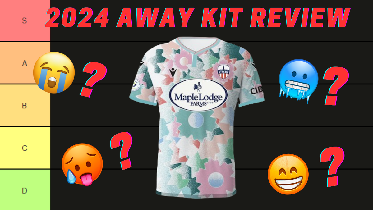
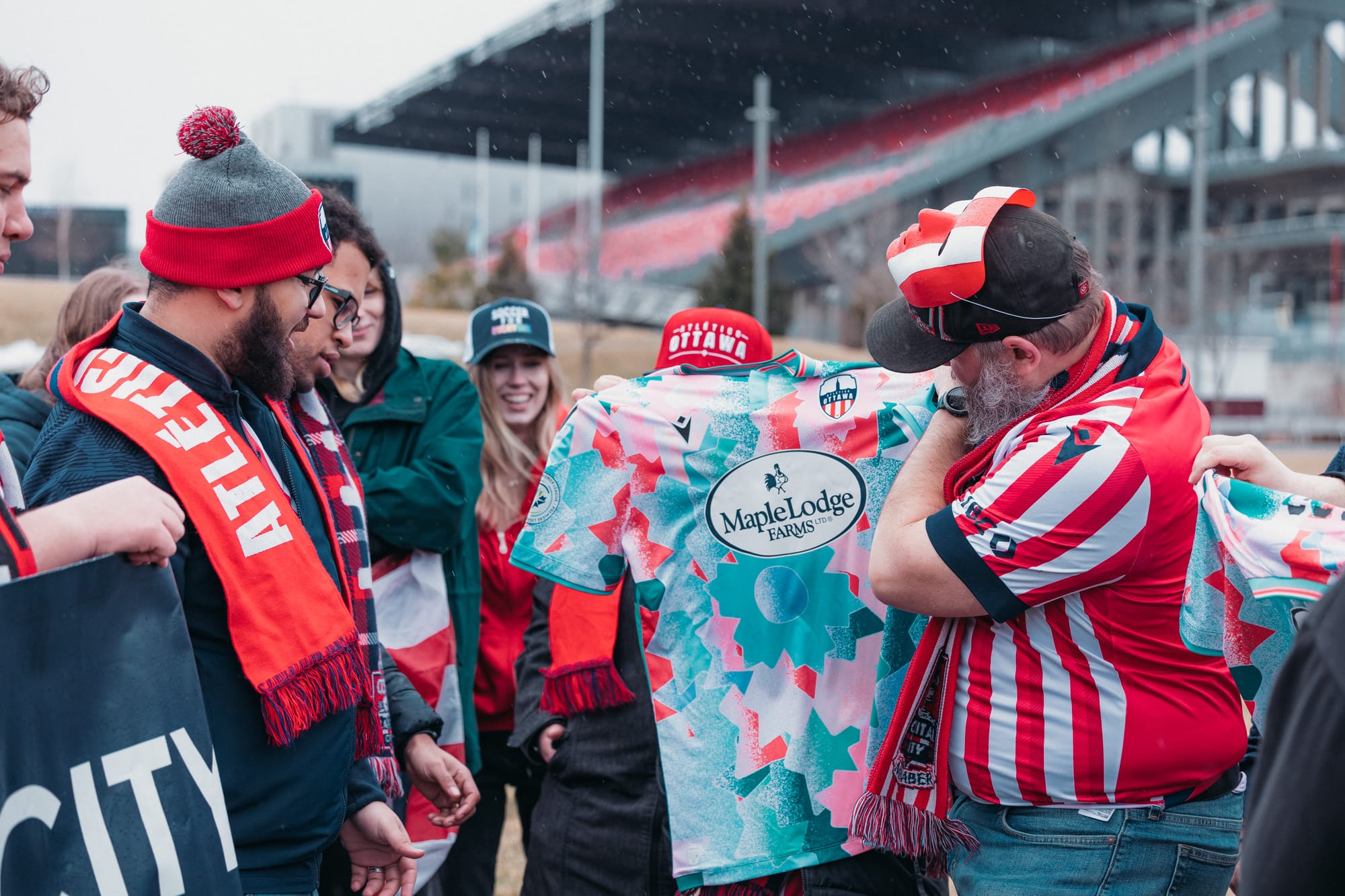
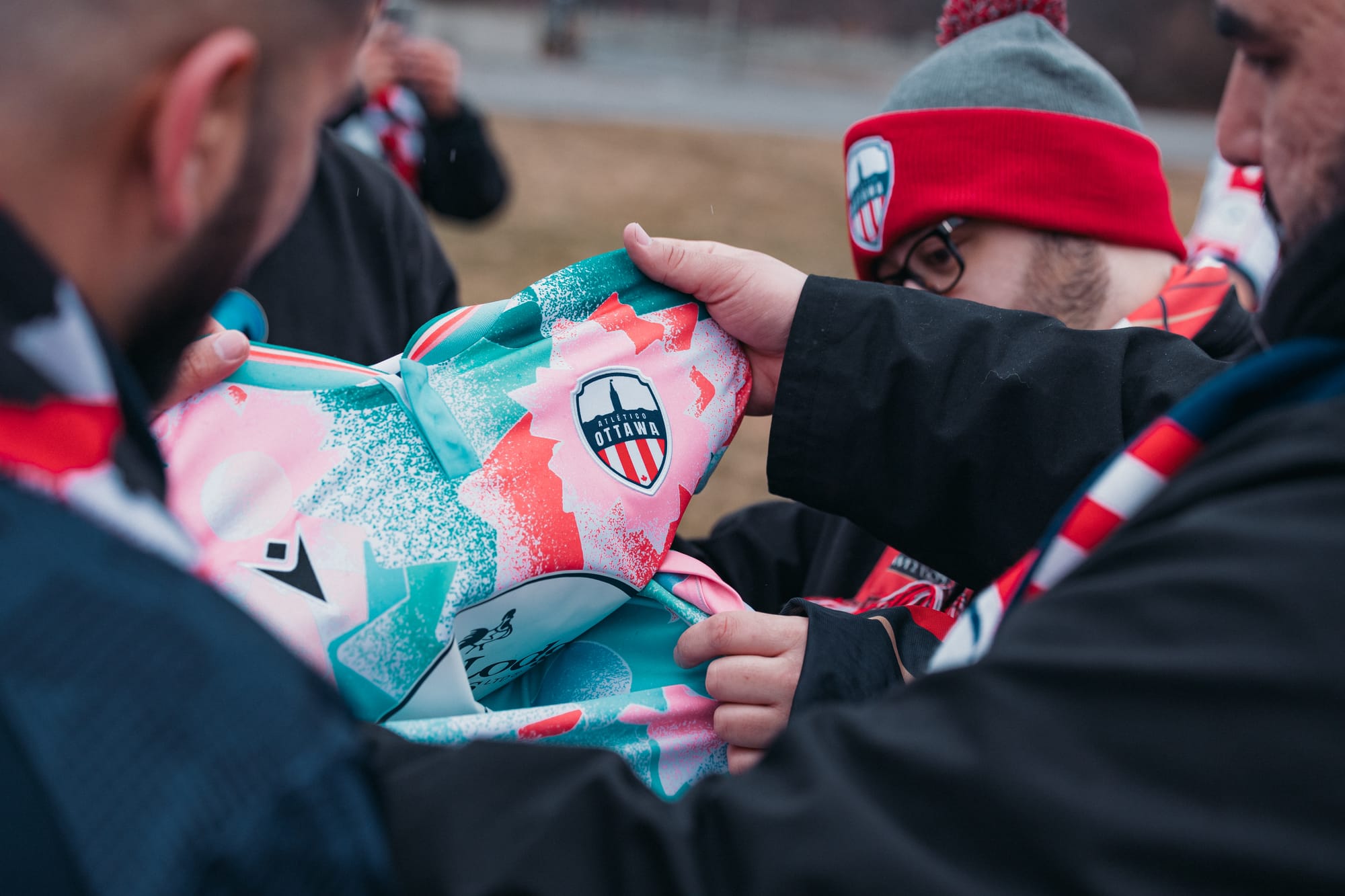
Just a short two weeks ago, we saw Atletico Ottawa’s new primary/home kit revealed. Now it is the turn of the alternate/away kit to see the light of day! Dubbed the “Soccer Culture Kit”, this snazzy design looks to blend creative design elements to “celebrate our community members shaping soccer culture locally and globally” - so sayeth the press release. Let’s take a look at this new kit, its details, and how it ties the fabric of a kit with the fabric of the community.
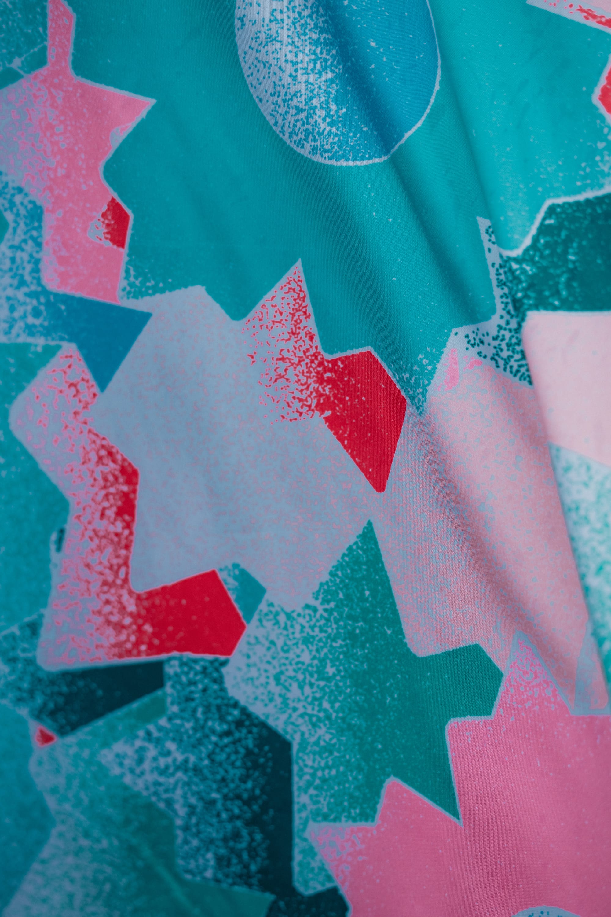
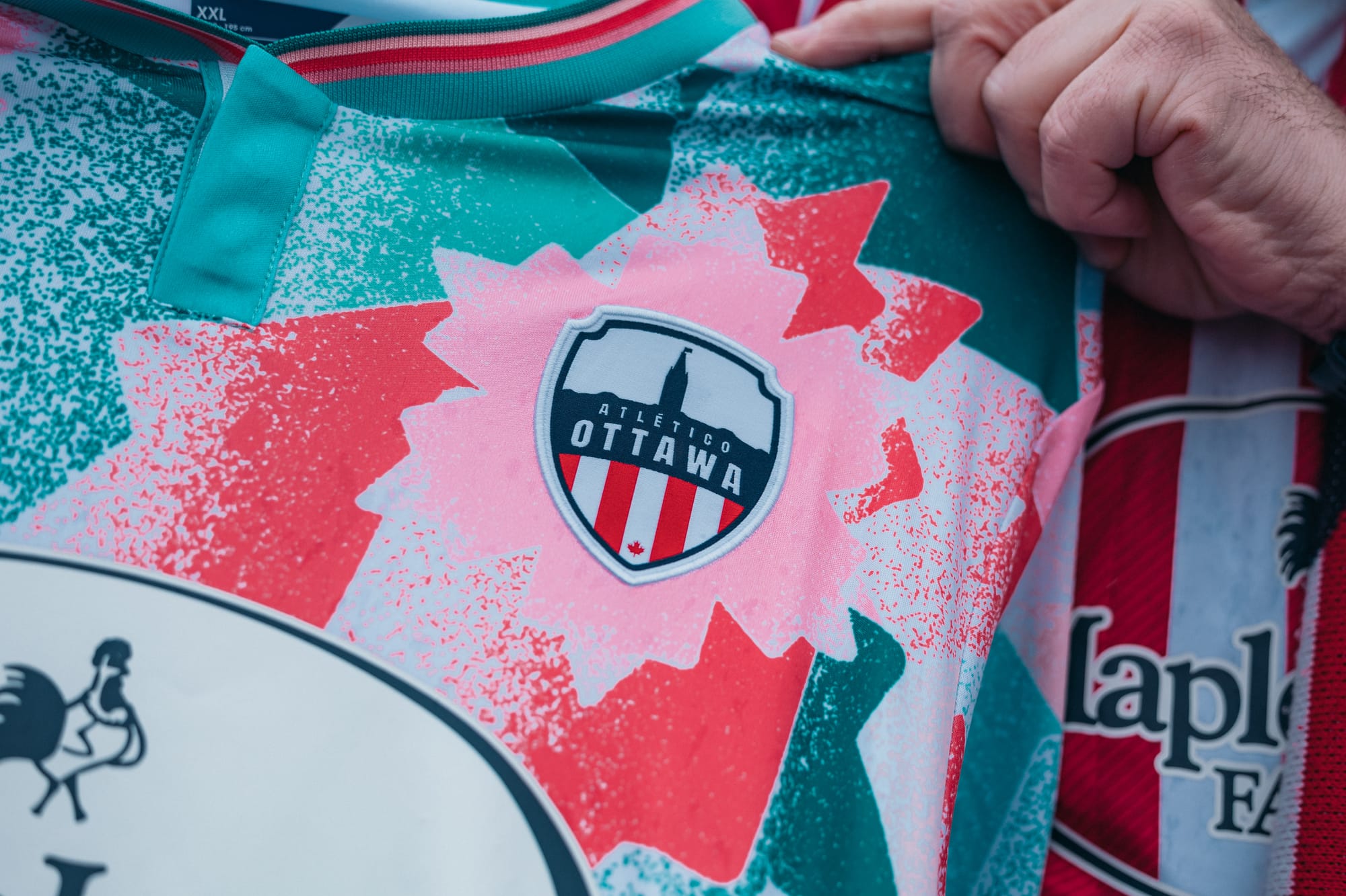
The entire kit is covered in an overlapping design of “radiant O’s” - the symbol used by Tourism Ottawa - and features several colours of these O’s. A muted green seems to take priority, followed by muted pink. Some yellow and light blue are also seen at various spots, also in a muted fashion. Some darker green provides a bit of contrast towards the shoulders. All these colours feature a very 90s-esque stonewashed effect, leaving some of the O’s to fade to white towards their radiant ends. I’m not the biggest fan of this stonewashed effect, but I must say it gives some needed texture to the kit. Overall, these O’s weave together a diverse colour palette to create a rather busy and vibrant kit. From a distance, it can be reminiscent of a tropical shirt, with floral-esque patterning and multiple colours.
Unfortunately, this design is covered up somewhat by the main sponsor logo, thanks in large part to the white oval plastered on the kit. Because of the varying pattern, the solid white contrasts well - too well - and stands out immensely. I find the badge and Macron logo blend in better, furthering this issue. I don’t love it when the sponsor takes away from the kit design, but I’m afraid it does so here. I think had they gone for a thick white border around the lettering and chicken, and finally dropped that oval, it might work better.
Moving on to the badge, which blends in a little too well, I would have liked to see a monochromatic navy badge. The red and white stripes are the main source of the blending in, so having the red swapped to navy might allow the badge to stand out more. Regardless of colour, however, I do really like the placement of the radiant O directly behind and encircling the badge. It ties the symbol of the club with the chosen symbol of the city quite well.
There are also a couple of smaller details, such as the aqua green (or a similar colour) used for the cuffs and for the majority of the collar. This is a nice-looking colour that complements the main colours of the kit well. Also seen in the collar are the pinks, red, and dark green seen in some radiant O’s. These accent the aqua green quite well and I am happy to see these colours make another appearance in the sock trim. It appears as though there are buttons in the collar, hidden by a panel of aqua green, which I must say is a bit of an odd choice, given the more modern look of the kit. I think a simple V-neck design as seen on plenty of other ATO kits in the past would have suited this kit more. Completing the kit are the Canadian Premier League logo and the CIBC logo, both on opposite sleeves. These are basic and do not take away from the kit, which is about all you can ask from league-mandated patches.
Comparing the two 2024 kits, they don’t initially appear to form a cohesive set, seeing as the home kit is very traditional-looking and this away kit is very modern (with some 90s flair). However, the theme of community is very strong in both kits, which is where the true connection between the kits lies. With the partnership with Tourism Ottawa and the vibrant design elements alluding to the diverse community we have in Ottawa, this away kit serves as another great symbol of community and the role that soccer plays in building and enhancing this community.
Overall, I find myself applauding the creativity of this kit and the ties to the community that it aims to represent. I think the colour palette does a good job of representing the diversity in Ottawa - and I like the celebration of diversity that the club is promoting. That said, there’s something about the kit that keeps me from falling in love with it. Maybe it’s the way two of the radiant O’s are so large and placed in awkward locations, especially the large green one on the stomach. I find it looks different enough from the rest of the smaller O’s that it takes away from the mixed patterning the rest of the kit has by drawing your eye towards them. I would have used two or three smaller O’s in their place to make the kit look more consistent with its patterning. It might also just be a matter of taste. I tend to prefer cleaner kits or kits with more uniform patterns than this one, so I might be in the minority when I rank this kit as B+ tier. A fine kit, just not one that particularly suits my style. That said, I am sure many people will love this kit and rock it in the stands and on the streets of this wonderfully vibrant and diverse city, so even if I’m not totally in love with it, I have to give credit to those who designed the kit.
What are your thoughts on this kit? What details would you change, if any? Where do you rank this new kit amongst the others in ATO’s history? Will you be picking one up this year? Let us know by tweeting @CapitalCitySG and using the hashtag #CCSG. As you may notice, the pictures used in this article are from a special sneak peak preview event that was held with the two official supporters groups, Bytown Boys and the Capital City Supporters Group. In order to access events like these, consider becoming a member by clicking the red button at the bottom of your screen!

About Josh

A soccer fan since his visit to Germany right before the 2006 World Cup, Josh Geauvreau has followed Atlético Ottawa since its inception in 2020. You can find him before most matches welcoming fans to the stadium while wearing an inflatable dinosaur costume. You can also find him singing loud down in the Dub come kick off.