ATO 2024 Home Kit Review: Classy Community Colours
The time has finally arrived for us to get our first look at the new primary/home kit for Atlético Ottawa’s 2024 season, dubbed the “Community First Kit”. The kit was officially unveiled today with season seat members like myself getting the opportunity to get a sneak peek yesterday at a community event. Let’s take a look at what this kit has to offer, both in design and club tie-in before we see it take to the pitch this season.

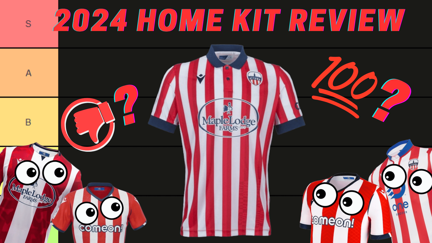
The front of the kit features the classic red-and-white striped design we have come to expect from Ottleti. This time, however, the stripes are much thinner than in previous years - the closest in terms of width are those on the 2021 home kit. With that, there are also many more stripes on the kit: nine red and eight white. The striped design is also seen on the sleeve, where it runs down its entirety. This combines to make for a dazzling look when facing the kit head-on. The badge and Macron logos are nicely centred on opposing white stripes and extend over to their neighbouring red stripes. The main kit sponsor is once again Maple Lodge Farms. I find that this year, the sponsor logo fits the stripes better, as the chicken is centred on the central red stripe and not awkwardly floating between the two thick red stripes of the 2023 home kit. Having the stripes continue through the Maple Lodge Farms logo is nice too, as it doesn’t place an awkward blank space on an otherwise thoroughly busy front. The navy colouring matches the rest of the kit’s accents, which we will get into later.

In contrast to the front, the back of the kit is quite plain. A solid red without any sort of subtle central back design - a first for an ATO kit - and features the Canadian Premier League motto “We Are Many, We Are One” on the lower back right. As in 2023, the stripes do not continue onto the lower back, giving a good amount of space for the player names and numbers to occupy without looking too busy. I’m sure commentators and referees will be happy with this! There are also two small navy triangles on the back that seem to be a result of the way the kit is cut more than anything. Another small line of navy sits just above where the player name would go, and I cannot see any reason beyond Macron’s kit template for this being there. At least it’s fairly inconsequential and should not take away from anything.
Other than the stripes on the front and sleeves, the most striking feature of this kit has to be the return of a collar and buttons, elements not seen since the inaugural home kit back in 2020. This time around, the design of these elements is sublime and avoids the missteps of that 2020 kit. The dark navy colour - which almost resembles black - matches the navy in the badge perfectly and gives a very sharp contrast to the otherwise busy-looking front and sleeves. The two buttons, which this time are on a red backdrop that blends in well with the centre red stripe, are also in navy to match the collar. Compared to the 2020 kit, which had an awkward white backdrop for the buttons that clashed with the red stripe, this combination of navy buttons on the central red stripe works really well. The kit looks very sharp and well put together as a result.

On the sleeves, we once again see navy cuffs, but this time they are much thicker than in previous years. I absolutely love these cuffs as they tie into the rest of the kit very well. They match the thick collar and again provide that contrast at the ends of the sleeves, making them pop. Also found on the sleeves are navy Macron logos, the league logo on the right sleeve, and the league sponsor CIBC on the left. The use of navy for CIBC helps tie it into the overall design of the kit - something that always works better than insisting on having your company colours on the kit.


When putting all these design elements together, you have a very traditional-looking kit, almost reminiscent of the early 20th century. Thankfully though, this kit isn’t made from that era’s thick wool or cotton. It, like in the previous two seasons, is made of lightweight polyester blends with at least some of the material being sourced from 13 recycled plastic water bottles - a Macron initiative. A nice touch in terms of waste diversion! It feels comfortable to wear and in my case, still requires sizing up one size to ensure a good fit. If you have other ATO kits, I’d say the fit is similar to those.
When you wear the kit, or even look at it up close, there are a few hidden details that pop out and help give a modern flair to this traditional-looking kit. The first one I noticed was a subtle two-tone design in the stripes, achieved through the use of two similar shades of red interlocking and changing sizes. On the left side of the stripe, a lighter red is present in thick diagonal lines, repeatedly broken up by a thin diagonal line of a darker shade of red. This pattern is then inverted on the other side of the stripe. The end result is the left half of the stripe being slightly lighter than the right half. This design carries throughout the stripes, though there is another detail hidden with these lines. In two of these stripes, towards the bottom right (left when worn), the colours of the diagonal lines are swapped in a way to spell out “For Ottawa” in one stripe and “Pour Ottawa” in the next stripe over. This super subtle detail ties the kit into the theme of community building - something that the club is really pushing with this kit.


The community-building theme of this kit goes beyond just putting a map of the city on the back of the kit, or using the city flag as design inspiration; there is a tangible effort being undertaken. The club has announced that in partnership with the Caldwell Family Centre and Maple Lodge Farms, each primary kit sold will feed a meal to 30 people (i.e., six families of five) facing food insecurity in Ottawa. By continuing its partnership with the Caldwell Family Centre, Atlético Ottawa seeks to continue their mission of using soccer as a vehicle to connect the diverse people of Ottawa, partner with community organizations to help those in need and make the sport accessible to all. A truly noble mission and one I am happy to see the club pursuing. It truly puts some weight behind the tagline of “Community First Kit” and shows that not all kit release details are just marketing fluff.
Overall, this new 2024 primary kit is a beauty. Retro-inspired using traditional elements, with enough modern subtlety to stay interesting, it’s truly a home run in my book. Pairing this with navy shorts and socks (with some small red/white details) will really complete the look. Compared to the other kits ATO has worn, this kit easily slots next to the 2022 away kit in the S tier, and it’s the best home kit I’ve seen. I’m very happy to see that the boys in stripes will be playing in such sharp kits for 2024. I hope that the away kit looks just as good and pairs well with this kit, and stretches the creative muscles a bit. But we will have to wait a little while longer for its reveal…

What are your thoughts on this kit? What details would you change, if any? Where do you rank this new kit amongst the others in ATO’s history? Will you be picking one up this year? Let us know by tweeting @CapitalCitySG and using the hashtag #CCSG. We hope to see you out at Lansdowne Park on April 13, where this kit will make its match debut against York United!
About Josh

A soccer fan since his visit to Germany right before the 2006 World Cup, Josh Geauvreau has followed Atlético Ottawa since its inception in 2020. You can find him before most matches welcoming fans to the stadium while wearing an inflatable dinosaur costume. You can also find him singing loud down in the Dub come kick off.