ATO Kit Ranking and Tier List (2020-2023)

by Josh Geauvreau
The 2024 season will bring some fresh new kits for our beloved Ottleti. While we wait for what’s in store, let’s take a look at the brief kit history of Atletico Ottawa… and rank them!
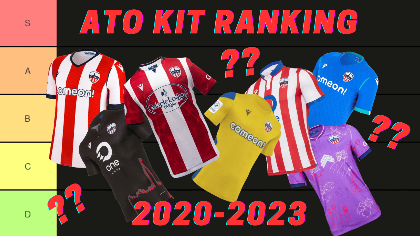
Not counting goalkeeper kits (which are just stock Macron kits anyhow), the boys in stripes have worn a total of ten kit designs in their four seasons in the Canadian Premier League. As a club with a clear visual identity in terms of colours and patterns, every year we have seen a red-and-white striped home kit, though each are still different from one another with their own twist. There have been three away kit designs, which is where the club has worked to try to be more creative (when they are allowed). Rounding out the list is two alternate kits, both in support of some great causes! Let’s take a look from the beginning and see how each kit stacks up.
2020 Home Kit: D

Unfortunately, the first ever ATO kit was a flop. The collar, while usually a classy touch on a kit, seemed out of place thanks to its white button detail on a red stripe and a lighter blue colour than that of the badge. This different shade of blue, also seen on the sleeve cuff and sponsor, clashed with the darker navy of the badge and makes the kit feel a bit disjointed. It was as if the people designing the kit hadn’t paid attention to the club colours, or did so with an intent that didn’t deliver.
To improve on this kit, I would have removed the red stripe from behind the sponsor placement to allow it to stand out more. I would have also changed the white button on the collar to red to make it more visible, and darkened the blue to match the crest. With that, this kit might have better fit the role of historic first kit. Thankfully, we can only go up from here.
2020 Away Kit: C

This design was a slight improvement over the home kit. As part of the league-wide “city kit” initiative, every away kit was a black shirt with an outline which was meant to represent the city. While it is not the most unique of kits, given every team in the league had one, the immediate return of black and red to an Ottawa football club was a welcome sight. Using the Parliament building as an emblem of Ottawa is about the easiest thing in the book, though it feels like the Parliament building design was just slapped on rather than being incorporated as a design. The inclusion of “Ottawa” in red text on the bottom of the back was neat and reminds me of German club kits.
To improve this kit, I would add some additional red details on the cuffs and collar in order to help the design express itself throughout the kit. Another change I’d have made was using a monochromatic badge - in full red - to truly make this a black and red Ottawa kit. Unfortunately, due to the pandemic and the 2020 Island Games, this kit was never worn at TD Place, and this iteration never saw use on a CPL pitch. Fortunately, we weren’t missing out too much.
2021 Home Kit: S

After the first crack at a Colchoneros-inspired home kit left a lot to be desired, the second go-around was near-perfection. I love the darker coloured red, the inclusion of navy details over the blue used in the 2020 kit, the use of thin stripes and solid sleeves. The “O-chain” design in the stripes is a nice, yet a subtle touch. While it is meant to be a symbol of community, it just ends up reminding me of the OC Transpo logo, which has unfortunately not been a symbol of hope or excellence in recent years.
There is not much I would do to improve this kit, other than finding a different sponsor. I despise betting sponsors, and there is not much worse than a betting sponsor named “Comeon!”. The jokes really write themselves here, and the team’s performance during the 2021 season had us promoting this brand with our frustrated cries of “come on!”. Other than that small detail, this is our best red and striped kit to date.
2021 Away Kit: C

Well, there is not much to say here given it is functionally identical to the 2020 away kit, so here is a fun fact: this version of the 2020 away kit design was only worn once all season - in the final match of the year on the road in Halifax. The one difference is the change from OneSoccer to Comeon as the sponsor, which is a downgrade in my book, though not one that warrants downgrading it to D tier. The on-field version also sported a small poppy above the badge, as part of a league-wide initiative to raise funds for the local branches of the Legion’s Poppy Trust Fund by auctioning the kits from the final matchday.
2022 Home Kit: A

If someone were to tell you to picture a red-and-white striped kit, this is probably close to what would pop into your mind. The three red stripes on the front are complemented by a red stripe down the sleeve. The lovely navy accents return on the collar, cuffs, and the macron logo. There is also a nice subtle line design in the stripes to give a bit of texture, though it does not seem to represent much.
I prefer thinner stripes on kits, but this was a nice way to change things subtly, without turning away from our parent club’s (and therefore our) identity. The Comeon! Sponsor again loses this kit points, but there is not much more I would ask of this kit. Perhaps have the pattern have a connection to Ottawa? But even then, that is dependent on being done well. All in all, it is a solid kit to win the league in.
2022 Away Kit: S

Can you say love at first sight? As a flag nerd, this kit really caught my eye when it was first revealed at Glebe Central Pub in March 2022. This beautiful away kit is inspired by the flag of Ottawa and has embossed “Ottawa O’s” throughout the front. The blue with slight teal touches works so well, particularly with the white shorts that were worn with this kit. Is it any wonder that we had a stellar away record in 2022 with a beautiful kit like this?
A nice detail I would have wished to see would have been the inclusion of the flag of Ottawa on the back collar, which would have really brought that extra little bit of detail. The flag not being there doesn’t lose it any points, and the embossing is such a cool textural detail that we haven’t seen on the other kits since. These details easily makes this my favourite kit.
2022 Third Kit: C-

Ok, let’s be real here: this is the only kit not designed specifically for Atletico Ottawa and it shows. It’s a very simple Macron teamwear design featuring the colours of the Ukrainian flag. Of course, that was the point, as this kit was worn as part of fundraising efforts at the beginning of the Russian invasion of Ukraine. The 2022 pay-what-you-want home opener, ATO and its fans raised money for humanitarian relief for the war torn nation. This kit being used for a good cause brings this otherwise plain and boring kit up from the D tier into C tier.
With more time to design this kit, I would have included a bit more blue detail, perhaps on the collar or with a subtle blue outline of the Ukrainian borders. Alternatively, the kit could incorporate the Ukrainian Trident Coat of Arms in a similar embossed manner as the blue away kit. The addition of sunflowers and a short motto of support on the back collar would also add to an “in-support-of-Ukraine kit”. I would also turn the ATO badge into a darker yellow monochrome so it blends into the kit, allowing Ukraine to take centre stage.
2023 Home Kit: B

We’re really losing stripes as we go along, eh? This kit features just the two red stripes on the front, with a fully red back for the first time. The solid sleeves make a return, though they do not cover the shoulder. The details in the striping are the shape of the city of Ottawa layered in different shades of red to give a camo like feel, which while creative, is not my preferred look. An outline of each ward is also included on the back, marking the first time an ATO kit has not had a large maple leaf on the back. Also included is a W to represent the loudest supporters section in the CanPL: Section W, aka The Dub. A nice sentiment, though its execution feels a bit lazy and crass.
If I were given the opportunity to make changes, I would remove the oval from the MapleLodge sponsor. While it is great to move away from ComeOn! And betting sponsors as a whole, the oval takes away from the kit itself. Assuming this is meant to reference the municipal boundaries of Ottawa, I’d try to instead draw a map of the city as a faded background in place of the “camo”. While less original, I think it would land better for me, though that is personal preference. I would also find a different way to include the W on the back of the kit in order to be a more subtle nod, perhaps placing it on the back collar or below the badge.
2023 Away Kit: C+

I’ve been torn on this kit since it was revealed. It’s simple, but the ice design fits well for the city with the world’s largest naturally frozen ice rink. That said, the colour changes blend together from a distance, making the kit appear quite plain, and up close it can be reminiscent of the generic marble kits so many clubs have done before. Nothing simply screams Ottawa, and in a country that freezes for half the year, it is tough to stand out. The navy accents fit well and bring some pop to an otherwise muted kit. Definitely one that looks better with a nameset on the back.
Again, I would lose the oval on the sponsor. I would also make the badge a monochromatic navy, as this would really fit this kind of light-coloured, relatively plain kit. Another nice touch could be the addition of the Rideau canal skating rink path, potentially on the back in the way the outline of the city was on the home kit, in order to really drive home the connection to Ottawa.
2023 Third Kit: B

Ok, I may get some stick for this but I’m not a huge fan of this design. The red drawings clash with the purple and the navy cuffs really should match the purple, red and white design on the collar. This was another charity kit and features a really unique feature of drawings from children who have survived situations of domestic abuse, which is a really beautiful touch. It is just a shame that the design did not make better use of their art. Their art, along with the great local cause the kit was supporting and featuring that charity as the “kit sponsor” bring it up from the C tier into B tier for me.
I do commend the club for expanding its partnership with Shelter Movers Ottawa and for wearing this kit on more than one occasion. I would love to see more charity alternate kits in the future, focusing on various local causes. These sorts of ties between club and community are great to see, even if the kit designs born from them leave room for aesthetic improvement. As noted above I’d make some changes to the sleeve cuffs and likely change the colour of the red drawings. It’d also be great to include more drawings from the kids to help further that connection.
Tierlist
With that, we’ve covered all the kits that Atlético Ottawa has worn in its short history. Here is how they stack up:

Do you disagree? Want to rank them differently? Follow this link to make your own version of this tierlist and share it with us by tweeting @CapitalCitySG and using the hashtag #CCSG.
It will be interesting to see where the 2024 kits will stack up once they are revealed! Will the new red-and-white striped kit have great unique details, or will it blend into the crowd? What will the away kit look like? What will inspire it? Will we have another alternate kit? All these questions circle in the heads of us kit nerds throughout the off season. Time will certainly tell how well-dressed ATO will be in 2024. Stay tuned for more kit-related content as we make our way towards the 2024 season!
About Josh

A soccer fan since his visit to Germany right before the 2006 World Cup, Josh Geauvreau has followed Atlético Ottawa since its inception in 2020. You can find him before most matches welcoming fans to the stadium while wearing an inflatable dinosaur costume. You can also find him singing loud down in the Dub come kick off.


