CCSG By The Numbers: An Introduction to Statistics (2024 Remastered)

AUTHOR'S NOTE: Due to a website migration, and further updates in my methodology, it was necessary to rewrite the article I penned in the winter of 2023/24. This is essentially the same article as that lost piece, with a few updated segments and a few new paragraphs. The player as an exemplar used also changed, because it was necessary to have an updated card.
How can we, as fans, tell if a player is good or not? The answer that comes to mind is simply by watching the game – known as the eye test. By watching the game holistically, individual players, and the interactions between the two, you should be able to tell the good from the bad. As much as the following article might seem like it's trying to convince you otherwise, the eye test is still necessary to give context to the statistics, and one should NOT be used without the other.
But what if you wanted to know exactly how good a player is, where they excel, where they might have flaws, and whether they can be measured against other players, and, as a result, how do they stack up against their peers? This is where statistics come in. For the last couple of years, I have been working to quantify these strengths and weaknesses, and the goal of this series is both to help you familiarize yourself with statistical methods, and to introduce you to my specific model of statistical analysis, in order to discover how players rank amongst their peers.
STATISTICS:
The first step is data collection. Take, for example, a hypothetical Player A and Player B (hereby referred to as A and B), and say that they both scored seven goals during the CPL season. Now, broadly speaking, they are both equally valuable players. The main goal of football is to score goals, and they both contributed the same towards that end. However, they might not be as equally efficient. The next step would be to look at how many games each played, which adds further context. But what if they both played the same amount of games?
If both players played a hypothetical 90 minutes (or one full game) without being substituted, who could score the most goals? This is called per90 statistics and helps normalize every metric. By dividing a player's goals by their minutes, and then creating a baseline of a full game by multiplying that number by 90, we can achieve a Goals p90 statistic (Goals/Minutes x 90). If A scored their seven goals in 600 minutes, and B scored their seven in 1000, we see that A achieved a Goals p90 of 1.05 – meaning that in a full game, they would score around one goal – while B achieved 0.63 meaning they would take around a game and a half to score their goal. By using these methods, we can see that A is much more efficient at scoring goals on a 90-minute basis, regardless of how many games they actually played. We could, therefore, say they had more goal-scoring impact.
A first comparative metric used in sports is Percentile Rankings. In the simplest terms, in a sample of data, how good was the result, really? The percentile formula will spit out a number, which essentially shows what portion of the sample the data point was higher than. Take, for example, A’s 1.05 Goals per 90 from earlier. If I were to run that calculation for every player in the CPL, how many players would they outperform in terms of scoring goals? In 2024, the answer for that would be literally every single player because scoring at a goal-per-game pace is unheard of. The formula would thus return a percentile ranking of 100% because they were better at scoring goals than 100% of the players in the CPL. For context, a ranking of 50% would mean that they are exactly average.
The second comparative metric, and the one factored most into the final output, is what I call Relative Ability, or more simply, Percentage Above Average. For example, if the average player scored 0.108 goals a game (the 2024 mark), and Player A had his 1.05, how much better is he than the average? For this we also need the worst player's numbers, so one who scored 0 goals. The formula would indicate that Player A is 89.71% better than the average CPL player. Like for the percentile rankings, this would make him the best relative goal scorer in the league (by a wide margin). Finally, to properly reflect this, I scaled the numbers so that said 89.71% comes out to 100, and the lowest figures (in the negatives) come out to 0, so that it mirrors the percentile ranks from earlier.
INITIAL OUTPUT:
To begin my analysis, I took 24 different statistics, including Goals, Assists, Passes, Tackles, etc, from every CPL player, converted them into p90 numbers, and then ranked them against each other using the percentile and the Relative Ability formulae. I then weighted both of those numbers such that the Relative Ability rank weighs more than the percentile rank, as I believe it gives a better indication of ability. These come out as a Score, from 0 - 100, so while they don't indicate something concrete like the player is better than X percentage of the population, or he is X better than the average, it mixes the two (hopefully) satisfactorily. Next, I added a colour gradient to help with comprehension (Blue = Above Average, Grey = Average, and Orange = Below Average) and included how that compares to the average of his position right below the corresponding box, as well as the raw data point, and where that ranks both in terms of percentiles and Relative Ability, in descending order. My spreadsheet then generates something like this:
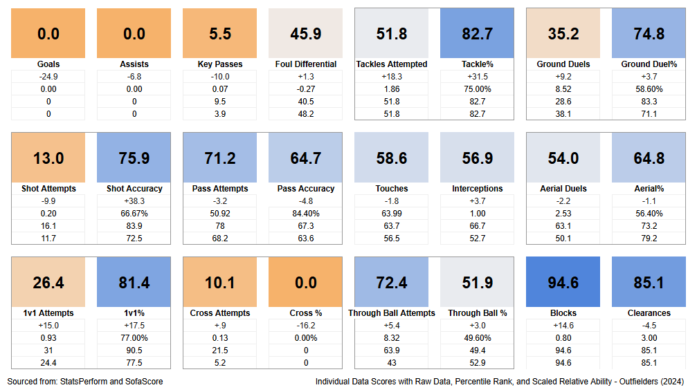
Above is Tyr Walker's statistical profile from 2024, and I know there is a lot of data there, so start with those dark blue boxes. His best mark was in terms of Shots Blocked (bottom right), where the spreadsheet gave him a score of 94.6. This is 14.6 points higher than the average CB, he registered 0.80 blocks per 90 minutes, and this ranked as a 94.6 in both percentile ranks and Relative Ability. Another good stat for him was his Tackling, in the top right. Here there are two boxes, bordered together to indicate their relation - Tackles Attempted and Tackle%. He was very good at completing his tackles (with a score of 82.7), but he only attempted them around an average clip (51.8). Again, the specific metrics are below their boxes. Down the line these will get weighted together to give him a Tackling score, such that his success rate matters a little more than his Tackles Attempted. These strengths make sense for a good defender.
His weakest stats mostly lie in the offensive categories, like Goals and Assists (top left), Crossing (bottom left), and Key Passes (top left again) - again, these make sense for a defender. You may notice the boxes are arranged such that the "Defensive" stats are in the bottom right, and "Offensive" stats in the top left, with more global stats in the middle.
MY MODEL:
I mentioned above that his strengths and weaknesses make sense for his position, and therein lies the final portion of this article, which will be the rating system that I came up with. How can we judge players if they play two different positions and thus have statistical profiles that vary wildly from one another? For example, a Striker and Centre-Back, the most diametrically opposed positions on the field? The simplest answer would be to simply average out their percentile ranks, right?
However, different positions have different jobs on the field, and therefore, their actions on the field and resultant statistics will have different quantities and qualities. For example, a Striker’s job is to score goals and not block shots, and a Centre-Back’s job is the opposite (although scoring goals would naturally be appreciated). In theory, it's possible that a Striker will record zero blocked shots, simply because they are almost never behind the ball that deep in their own half. Their percentile ranking (for example) for blocked shots would, therefore, be 0%, but they shouldn’t be penalized for that because that isn’t their role. Conversely, if a Striker is not scoring any goals but blocking a lot of shots, their rating should not be the same as a colleague doing the opposite, and actually contributing what is expected of them as a Striker.
Long story short, I tried to balance each statistic based on how important they were to fulfilling a player's position on the field. For example, a Striker’s Goals and Assists (G/A) percentile and Relative Ability rankings matter a lot more than their blocked shots because that is what they are there to do. In weighing all the stats such that the total weight is equal to 100, G/A accounts for more than half of the final output (for a Striker). Of course, the weight changes for each statistic based on the position. Each positional weight takes into account the 24 statistics I collected and ranked and produces a Weighted Percentile Average (WPA). It sounds fancy, but don’t worry about it. When looking at my work, all you need to know at a glance is that 50-60 is typically the average in any given season, anything 65-75 is good to great, and 80+ is amazing. The highest grades in a season typically fall in the high 80s. Tyr Walker's simple WPA in 2024 was 65.3. Note that this does NOT mean he was better than 65.3% of CPL players in 2024. Even though it uses percentile rankings as a portion of its model, it acts more like a rating system akin to one you would see on football apps or websites.
One thing of note here is that the relative weights of each metric are entirely arbitrary. My experience playing and watching the game has led me to value certain characteristics in a player and a position; thus, I have weighted the stats accordingly (also, some adjustments were necessary to make the grades come out relatively equal – more on that later). Someone else might have slightly different priorities and thus might have different weights – every advanced metric model will have its own bias according to its author. While the relative weights are mostly personal, there were some compromises to general consensus, so while my model might never be fully transparent, I hope it does reflect a certain universality.
The next adjustment takes into account a player's minutes played and their WPA grade. The player’s grade can get boosted under two conditions, the first being if they played better than average for more minutes than average, because it is harder to play at a high level over a larger sample size. I consider this a reward mechanism because of said difficulty. They can also get boosted if they played fewer minutes and graded lower than average, because they perhaps didn’t have enough opportunities to make an impact, but I would consider this a reduction in punishment rather than a reward.
Secondly, the player’s grade can get lowered under the opposite conditions. If they played worse than average but played more minutes, they get lowered because they had the opportunities and couldn’t make the most of it. This is entirely a way to punish those who kept getting selected but couldn’t perform. Finally, they also get lowered if they played better than average but over a smaller sample size, to ensure they are not graded the same as someone who played more minutes but at the same high level. By taking minutes and WPA grade into consideration, I came up with a formula that returns a scalable factor, which then gets added or subtracted from the original grade. After running Walker’s rating through this formula that acknowledges that he played better than average for more minutes than average, it gets boosted slightly.
A final adjustment is made to make every positional group comparable. Due to inherent imbalances in the metrics used, and simply the nature of certain positions (for reasons too complex to lay down briefly, Full Backs get extremely shortchanged using an unadjusted grade), not all simple WPA grades are created equal. Some come out boosted across the board, some have ranges too small to leave their highest achievers among the top players, and so on. Thus, I have to manipulate the positional group's grades systematically to make each one's mean and standard deviation approximately equal. Doing this to Walker's 2024 mark gives him a final Adjusted WPA of 71.8. All this information and more subsequently gets presented in something that looks like this:
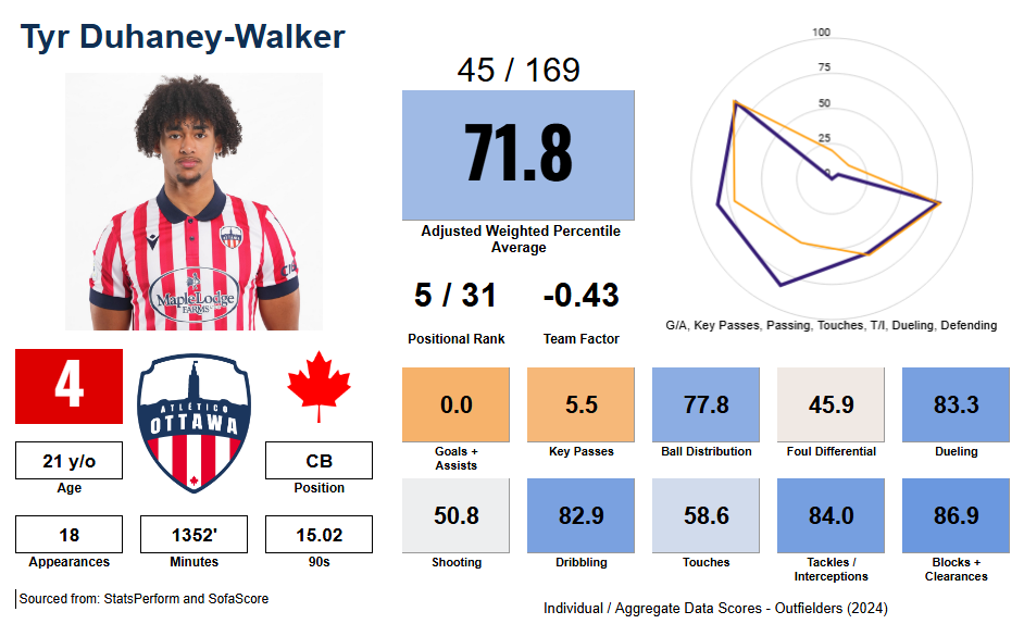
Moving left to right, first off his personal information, such as his name, number, club, etc, as well as his age and position are in the bottom left. His stats are also there, so his games, minutes, and 90s (this last can be used in conjunction with his games to determine approximately how many starts he received, and how deep he went into games). In the top middle, his adjusted WPA grade (71.8), as well as where that ranks in the league (45th), and versus his positional group (5th). The team factor box can be ignored, however it shows that in terms of WPA grades, Atlético Ottawa averaged higher relative to the other teams than their final position would indicate (they had the second-highest average, but finished third). If you like to take into account team performance with individual achievement, this can be added to the WPA grade - in Walker's case, this means subtracting 0.43.
Finally, his actual scores are on the bottom right. These include some directly from the previous card (like Key Passes, which are generally defined as a pass that results in a shot but not an assist), but most have been aggregated (for example, Dribbling consists of the scores from 1v1s attempted AND 1v1 success rate weighted together). In this category, he was given a score of 82.9, because while he didn't attempt many, he beat his man often when he did, and ultimately that is what matters. I have chosen seven to be represented in a radar chart (top right), which can be consulted to give a quick impression as to Walker's strengths and weaknesses. His stats are represented by the heavy purple line, and the average graph for a CB (or any position) is the orange line. More defensive stats are on the left/bottom, more attacking stats on the right/top, so by comparing the two graphs you can see Walker was better defensively than most CBs but lacked offensive flair (relatively speaking of course).
All of this info has been collated together in one (hopefully simple) card in order to quickly assess a player's season. I post them @CPLNumbers on BlueSky, and for various CCSG articles detailing a team's season, potential/incoming transfers, etc. Feel free to reach out to me on socials or through the CCSG Discord!
About Alexander:

When he isn't busy playing or watching sports (or going to school at uOttawa), Alexander is busy managing his Atlético Ottawa database, which he started in 2020, and tracks everything you can think of about the club and its players. He also runs a Twitter account dedicated to analyzing and rating CPL players using statistics, CPL by the Numbers.
