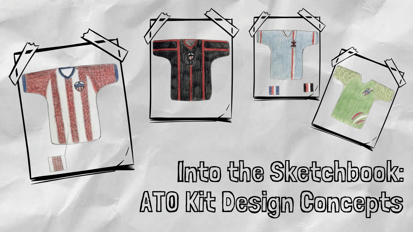
Into the Sketchbook: ATO Kit Design Concepts
by Josh Geauvreau
Ah, the pre-pre-season. The time of the footballing offseason when roster and transfer news really starts flowing, the actual pre-season hasn’t quite yet begun, but the pieces start falling into place, and the anticipation for the new season really starts to ramp up. A big part of this time is the anticipation for, and the release of, the new kits that will be worn by each club as they compete week after week.
We have already seen Cavalry FC reveal their new kits for 2024, so it’s only natural to rev up the excitement for the 2024 Atlético Ottawa kits! Of course, it’s highly likely that we will see a new red-and-white striped home kit, but the away kits have been different most seasons - something we took a look at previously when we ranked the kits of our beloved Ottleti. Speculations and questions abound when it comes to what the full look of Atlético Ottawa will be like in 2024. While this season’s kit designs are already set in stone, it can still be fun to explore the “what ifs” and “if onlys” of kit design. To this end - and in the spirit of doodling in your school notebook during a boring class - I’ve drawn up five concept kits. No Photoshop, fancy graphics or art degrees here, just plain old pencil crayons and ideas. The simple way. Each kit features elements that I would love to see Atlético Ottawa wear, even if the official kit doesn’t look like my concept. Let’s take a peek into my sketchbook and see what a future ATO kit might look like.
Kit 1: The Icon Kit

Ever since 2020, when Atlético Ottawa was revealed to the world, I’ve looked at the navy in the badge and hoped for a navy with white accents away kit to complement the red-and-white stripes. Several clubs wear blue with white, famously Chelsea and Everton in England, Schalke in Germany, and even the former FC Edmonton of the CanPL. For this concept, I went for a simple white collar and cuff detail, along with a white patch on the underarms to add a touch more “blanc d’Ottawa” (the official branded colour name for white in the club identity). As it was similar to many blue kits of the past and present, I felt there was something else I could do to really make this kit an Ottleti kit. That’s where I looked back to the badge which inspired my desire for a navy kit and knew what to place: a central hoop in the design of the navy-coloured parliament building that cuts across the centre of the badge. Putting this across the chest ties the iconic Peace Tower and club identity together, in a way that uses the Peace Tower in a better fashion than the 2020/2021 away kits did. By making the centre hoop a touch darker than the rest of the kit, I hoped to blend the two together from a distance, becoming a detail that is best appreciated close up. It also helps make the away kit a solid dark colour to contrast perfectly with the red-and-white. To me, a navy away kit is a no-brainer, and I hope to see one at some point!
Kit 2: The Paddle Kit

Another aspect of club identity that has seemed relatively underutilized is our secondary logo - the “AO Paddle”, as I sometimes call it. Borrowing the design from an aspect of the city’s coat of arms (which represents the Indigenous peoples of this land, the Algonquin Anishinaabe Nation), this simple logo has struck me as a logo that is 100% Ottawa without being clearly derived from the Atlético de Madrid badge. In my mind, using this logo on an away kit would be a perfect way to use this logo in a more prominent way than on a handful of merch items. Many clubs have done similar concepts, such as Arsenal using a simplified cannon on their away or alternate kits. In that vein, this kit features the AO Paddle in all-red, with a simple offset column of red and white above and below the logo. The red and white obviously being representative of our home colours, allowing us to wear them even while on the road, and the simple two stripes capable of representing “A” and “O”. I included this red and white striping on the sleeves as well, with red being above white when worn, to add another pop of red and white to the kit. I went for a light blue base for two reasons: Atlético de Madrid has worn a similar away kit before, only with red and white collar and cuff details, and the light blue works for a bright yet contrasting colour for the away kit. To some, it can also be viewed as representing the water on which the paddle would be used. However, seeing as we’re not a Caribbean island and our waters are much darker, I’ve also included the colour block for what this kit might look like with a navy base. To take things a bit further with the Ottawa connection, the return of a black-based away kit is also shown for this design. Regardless of the final design, I would really love to see the AO Paddle used on an away or alternate kit!
Kit 3: The Legacy Kit (or the 613 Kit)

Ottawa’s sporting heritage has often been associated with the colours of black and red, often with white accents. The original Senators won their Stanley Cups of the early 20th century in these colours, while the current Sens also wear them. The 67s wear rather unique barber pole jerseys in these colours. The Redblacks sport not only the colours but also take their name from them, not to mention the Rough Riders before them also sporting the colours. Perhaps most famously in soccer circles, the Ottawa Fury wore them to an NASL Soccer Bowl appearance. Ottawa sports, quite simply, are synonymous with black, red and white. Of course, Atlético Ottawa gets its colours from the Spanish capital, Madrid, meaning the black was dropped in favour of navy - a slight but noticeable change from “Ottawa’s colours”. So to re-affirm Ottleti’s place in the Ottawa sporting sphere, I would love to see the return of a black and red kit. In this concept, I’ve done just that, using a black base and three red stripes on the chest and three more on each sleeve. The stripes are thinner to avoid looking exactly like the 2019 Ottawa Fury home kit (though this kit was definitely an inspiration for this concept). It also helps make black the prominent colour, seeing as red takes a leading role on the home kits. A centralized badge above the area code 613 written in white put Atlético Ottawa and its relationship to the city and its sporting history on centre stage. Bold and brash, showing to all opponents where ATO calls home, this kit brings the identities of ATO and Ottawa sports closer together. As a final touch, I’ve replaced the navy in the badge with black to complete the tricoloured look.
Kit 4: The Striped Dino Kit

Alright, enough away kits. It’s time to look at what a home kit could do in the creativity department. Normally, home kits are fairly consistent year over year, and I think that’s a good thing. It cements the club’s identity and is what most people will picture when they think of a given club. Manchester United and Bayern play in red, Dortmund and Villareal play in yellow, and Atlético Madrid and Atlético Ottawa play in red-and-white stripes. The unfortunate drawback to this design philosophy is the limited space for creativity it can present. We’ve seen how each ATO home kit has looked fairly similar from a distance, yet they have made each home kit unique by varying the number and thickness of stripes and including different subtle details. I’ve tried to do the same here, by tying the famous stripes with the famous scales of everyone’s favourite football-loving t-rex, Wally. Using a simple stripe pattern and full red sleeves, I included a scaly pattern in the red parts of the kit. I included blue cuffs and a collar to add a pop of extra colour, and make it look the part of an Atleti home kit. Ideally, the lines outlying the scales would be a slightly different shade of red, becoming visible up close but blending well from a distance, so as not to make the kit feel too busy. Given the types of embedded details Macron has used in the past, I’m sure they could make a kit like this really pop. Maybe adding a neck detail with Wally’s name would help cement this home kit as Wally’s home kit.
Kit 5: The Wally Kit

To pair with the Striped Dino kit, I figured what better way to use the extra creativity granted by an away kit (which is typically less tied to club identity) than to go all-out on the Wally theme? A darker green body is paired with sleeves with the same scaly sleeve pattern as in the stripes of the home kit. The sleeves are coloured in a lighter green, with some scales being a brighter green, to give some contrast and variance to the kit as a whole. As a nod towards the club colours, I’ve also included two claw marks in red and white: one behind the badge and one on the front left (when worn) of the kit. These also form a shape reminiscent of the City of Ottawa logo, with the three lines that come off the “O”. This marries the t-rex-loving side of ATO with elements that represent both club and city to form a unique away look that I’m sure would be remembered for years to come. For added flair, we could add a pair of yellow eyes to the back collar, so that any opposing player is slightly more intimidated… or so we can hope!
Conclusion
With these five concept kits, I’ve aimed to explore concepts and design elements that I would love to see on this year's (or future years) ATO kits. I wholeheartedly believe that despite the branding inherited from our parent club Atlético de Madrid and the need for certain kit specifications (i.e., a contrasting away kit design), there is much room for the ATO design team to develop creative and beautiful kits with lots of meaning for fans and players alike. Of all of these ideas, I most want to see a Wally-inspired kit, either incorporated subtly into the home kit or all-out as an away/alternate kit. Wally is a truly organic, fan-led creation that was born here in Ottawa’s growing and thriving supporters culture, and it would be amazing to see that reflected in a kit one day. But for now, all I have is my imagination and my sketchbook.
What did you think of these concepts and their design elements? How would you improve these concepts? Are there other design elements you would like to see? Let us know by describing or preferably drawing your ideas! It’s always great to get a discussion on kits going. To that end, join us in waiting for the reveal of the official 2024 Atlético Ottawa kits in the near future, and stay tuned for a review of them once they drop.
About Josh

A soccer fan since his visit to Germany right before the 2006 World Cup, Josh Geauvreau has followed Atlético Ottawa since its inception in 2020. You can find him before most matches welcoming fans to the stadium while wearing an inflatable dinosaur costume. You can also find him singing loud down in the Dub come kick off.